
Picture this: a VP of Marketing is evaluating email marketing platforms. She's narrowed it down to three options and lands on your comparison page. She scrolls to the feature table, sees 47 rows of technical specs, and her eyes glaze over. Thirty seconds later, she's back on Google looking for something easier to digest.
We've all been there as buyers. And yet, when we create comparison content, we often make the same mistake—cramming in every feature we can think of, assuming more information equals better help. It doesn't. According to research from the Nielsen Norman Group, users scan web content rather than reading it thoroughly. Feature tables are no exception.
The best feature comparison tables aren't comprehensive feature dumps. They're curated decision aids. They highlight the differences that actually matter to buyers and present them in a way that makes comparison effortless. For the complete SaaS comparison strategy, see our SaaS Comparison Page Playbook.
What Feature Tables Are Actually For
Before designing a table, you need to understand its purpose in the buyer journey. Feature tables serve decision-stage users who have already done their initial research. They know what the products are. They probably have a sense of which ones might work. What they need now is validation—a clear view of how options compare on the criteria they care about.
This means your table isn't for education. It's for comparison. The user shouldn't learn what a product does from your table—they should see how products differ. That distinction changes everything about how you design it.
Think about what happens when someone reaches your comparison table. They've already read your descriptions of each product. They've seen your recommendations. Now they want to validate those recommendations against their specific needs. Maybe automation matters more to them than you emphasized. Maybe they need HIPAA compliance and want to quickly check which options support it. The table is their final check before clicking through to a product site.
When you understand the table as a validation tool rather than an education tool, you realize that including every feature is counterproductive. Buyers don't need to see that all three email platforms can send emails. They need to see where the platforms diverge.
Selecting the Right Features to Include
The hardest part of creating a useful feature table is deciding what to leave out. Every product team wants their favorite differentiators included. The temptation is to add rows until the table becomes “complete.” Resist that urge.
Start by identifying the features that actually influence buying decisions. Research from Gartner consistently shows that B2B software buyers prioritize a small set of factors: ease of use, integration capabilities, pricing structure, and support quality. Everything else is secondary for most buyers.
Look at your own data if you have it. What do sales calls reveal about buyer priorities? What questions come up most in demo requests? If you're an affiliate or publisher, check the review sites like G2 and Capterra to see what reviewers mention most frequently.
I generally recommend limiting feature tables to 8-12 rows for most comparisons. That's enough to cover the major decision factors without overwhelming scanners. If you genuinely need more, consider splitting into multiple focused tables—one for pricing, one for features, one for integrations—rather than one massive grid.
There's another filter to apply: differentiation. If all products in your comparison share a feature, including it adds noise without adding value. Users don't need to see that every CRM has contact management. They need to see that only two of the five have built-in calling features.
Organizing Features by Category
Once you've selected your features, organize them in a way that matches how buyers think about their needs. Random ordering forces users to hunt for what matters to them. Logical grouping makes scanning effortless.
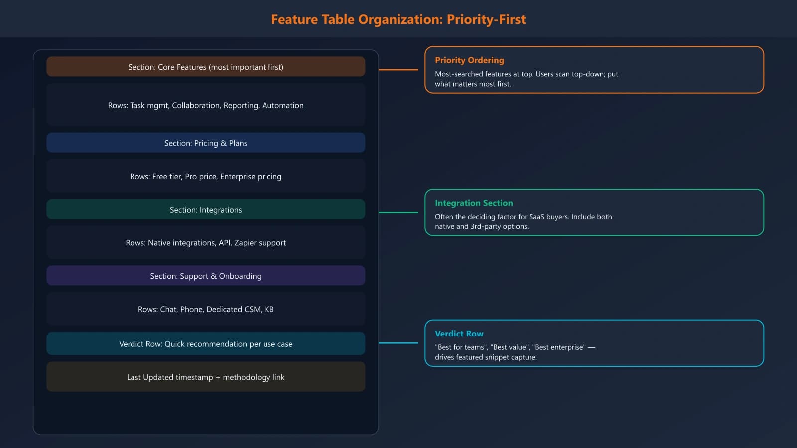
For SaaS products, I typically see four natural categories emerge. First, core functionality—the essential capabilities that define what the product does. Second, pricing and plans—free tiers, starting prices, enterprise options. Third, integrations and ecosystem—what other tools it connects with. Fourth, support and service—help resources, SLAs, implementation assistance.
Within each category, order features by importance. Put the most commonly sought features at the top where they'll be seen first. Save edge cases for the bottom. This way, most users get what they need quickly, and those with specialized requirements can still find their answers.
Some comparison pages use expandable sections to manage long feature lists—showing the top 5-6 features by default with an option to expand for more. This can work well when you genuinely need comprehensive coverage but don't want to overwhelm casual browsers. Just make sure the collapsed view includes the features most users care about.
Writing Clear Feature Descriptions
The content in your table cells matters as much as your feature selection. Vague labels like “Advanced Analytics” tell users almost nothing. What makes it advanced? What can they actually do with it? Meanwhile, overly technical descriptions alienate non-expert buyers who might be the actual decision-makers.
The sweet spot is specific but accessible language. Instead of “Advanced Analytics,” try “Custom reports with 50+ metrics.” Instead of “Enterprise-grade security,” try “SOC 2 Type II, HIPAA compliant.” Give users concrete information they can evaluate.
For yes/no features, avoid relying solely on checkmarks and X marks. While visually clean, they can be ambiguous. Does a checkmark mean “fully available” or “available with limitations”? Consider using brief text instead: “Included,” “Pro plan only,” “Add-on ($49/mo),” “Not available.” This removes ambiguity and gives users the context they need.
When features require explanation, don't cram it into the cell. Keep cells scannable and use tooltips or expandable notes for details. The table should work as a quick reference—users who need more context can click or hover for it.
Generate SaaS Comparison Tables That Convert
Build feature comparison tables with the right structure, clear differentiators, and scannable design. Stop guessing what to include.
Try for FreeVisual Design That Aids Scanning
Visual design isn't about making tables pretty—it's about making them scannable. Every design choice should answer one question: does this help users find and compare information faster?
Row striping is a simple technique that dramatically improves readability. Alternating row colors help users track across wide tables, reducing the chance of reading the wrong cell. Subtle works best here—slight gray alternation rather than bold color contrasts.
Column highlighting can emphasize your recommended product without being heavy-handed. A light background tint on one column says “we suggest this one” while still letting users evaluate independently. Some sites add a “Best Choice” or “Editor's Pick” badge in the header, which works well when you have a clear recommendation.
Sticky headers are essential for tables that extend beyond one viewport. When users scroll down through features, they need to remember which column is which product. A sticky header row that follows as they scroll prevents constant scrolling back to check which column they're looking at.
Typography matters more than most people realize. Feature names (row headers) should be visually distinct from values. Bold row headers with regular-weight values creates clear hierarchy. And please, keep cells aligned consistently—left-align text, right-align numbers.
Making Tables Work on Mobile
Feature tables are notoriously difficult on mobile screens, but with more than half of web traffic coming from mobile devices, you can't ignore the challenge. The standard desktop table simply doesn't work on a 375-pixel wide screen.
The most common solution is horizontal scrolling with a fixed first column. The feature names stay visible while users swipe left and right to compare products. This works reasonably well if you include clear visual cues that more content exists—a gradient fade or partial column visibility that invites swiping.
An alternative approach transforms the table into stacked cards on mobile. Each product becomes its own card showing all features, and users scroll vertically through products rather than comparing side-by-side. This sacrifices direct comparison for readability—sometimes a worthwhile trade-off depending on your content.
Some sites offer both views with a toggle, letting users choose their preferred format. This adds complexity but acknowledges that different users have different preferences. If your analytics show significant mobile traffic on comparison pages, it's worth considering.
Whatever approach you choose, test it on actual devices. Emulators don't capture the reality of trying to tap precise cells with a thumb or the frustration of horizontal scroll that fights with page navigation. Real device testing reveals problems that desktop previews miss.
SEO Considerations for Feature Tables
Feature tables can help or hurt your search performance depending on how they're implemented. The key is making table content accessible to crawlers while maintaining good user experience.
Use semantic HTML table markup rather than CSS-styled divs. Proper thead, tbody, th, and td elements help search engines understand the table structure and the relationships between headers and data. This is basic but often overlooked—I regularly see comparison pages using divs that look like tables but aren't structured as such.
According to Google's structured data guidelines, well-structured tables can appear in enhanced search results. While there's no specific schema for comparison tables, proper HTML structure combined with ItemList schema for your overall comparison makes your content more parseable by search engines and AI systems alike.
Don't hide important table content behind JavaScript interactions. If features only appear when users click “expand,” search engines may not see them. Either include the full table in the initial HTML or use progressive enhancement techniques that still expose content to crawlers.
Feature tables also present an opportunity for long-tail keyword targeting. Users search for specific feature comparisons—“Mailchimp vs ConvertKit automation features” for example. A well-structured table with clear feature labels can rank for these specific queries.
Mistakes to Avoid
After reviewing hundreds of SaaS comparison pages, certain mistakes appear again and again. The most common is feature overload—tables with 30+ rows that no one actually reads. Remember, you're building a decision aid, not a specification document.
Inconsistent data is another killer. When your table says Product A has “AI-powered recommendations” but Product B's equivalent feature is listed as “Smart suggestions,” users can't tell if these are the same thing. Use consistent terminology across columns so comparisons are actually comparable.
Outdated information destroys credibility fast. If your table shows pricing or features that are no longer accurate, users will question everything else on your page. Build processes to regularly verify and update table data—especially pricing, which changes frequently.
Finally, many tables fail on accessibility. Missing scope attributes, poor color contrast, and click targets too small for touch all create barriers for some users. Beyond being the right thing to do, accessibility often correlates with better usability for everyone. The W3C provides excellent guidance on accessible tables.
Tables That Actually Help
The best feature comparison tables don't try to be comprehensive. They try to be useful. They focus on features that actually influence buying decisions, present information clearly enough that anyone can understand it, and make visual design choices that aid rather than hinder scanning.
Start with your buyers' priorities, not your product team's feature list. Cut ruthlessly until you have 8-12 rows of truly differentiating features. Write descriptions that a non-technical executive could understand. Design for scanning, not studying. And always, always test on mobile.
Feature tables are among the most referenced elements on comparison pages. When you get them right, they become genuine decision aids that users appreciate—and that appreciation translates to trust, clicks, and conversions.
For the complete SaaS comparison strategy, see our SaaS Comparison Page Playbook. And for broader conversion optimization, explore our CRO for Listicles guide.
Product Manager at BestPage. Pioneer in AEO research since 2024, exploring the convergence of SEO and GEO (Generative Engine Optimization). Led multiple AI-powered content optimization projects that achieved 300%+ citation increases in ChatGPT and Perplexity.