
Here's the thing about listicle conversion optimization: most advice out there is either too generic (“add more CTAs!”) or actively harmful (“put popups everywhere!”). And I get why—traditional CRO wisdom was built for landing pages and checkout flows, not for content pages where users are still in research mode.
Listicles are a completely different animal. Your visitors aren't ready to buy when they land. They're comparing, evaluating, building mental shortlists. Push too hard and they bounce. But be too passive and they leave without clicking anything, off to check the next result in Google.
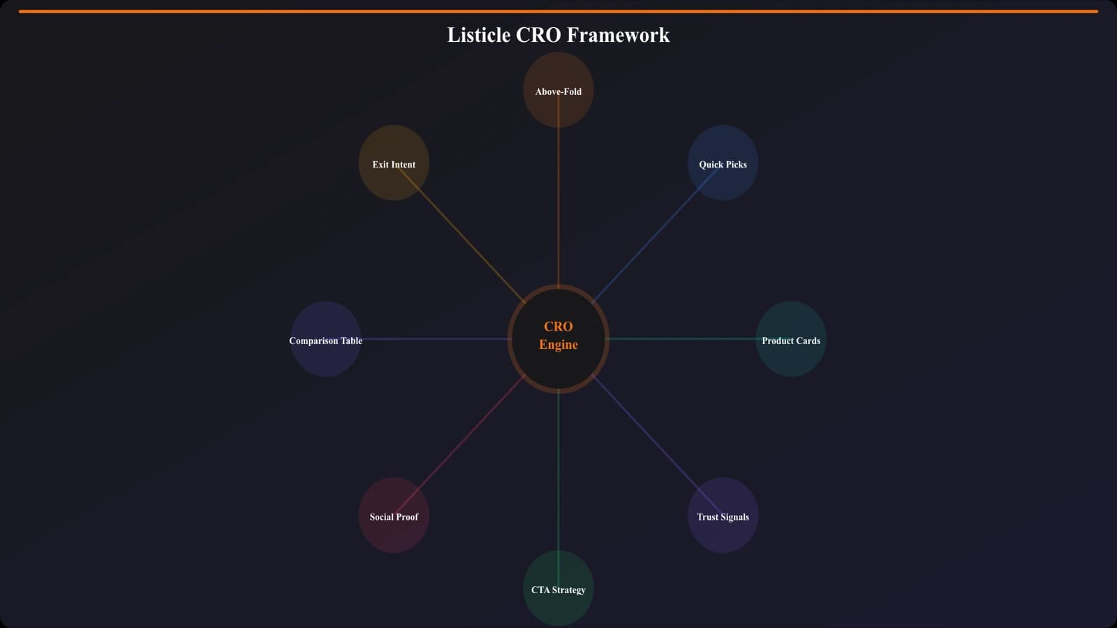
The conversion framework I'm going to walk you through was built specifically for this tension. It's based on analyzing thousands of high-performing listicle pages and testing dozens of layout variations. The core insight? You optimize listicles by making them more useful, not more aggressive.
Every element we'll cover—from above-the-fold content to sticky navigation to product cards—is designed around one question: how do we help visitors make better decisions faster? Answer that well, and conversions follow naturally.
Understanding How Listicle Visitors Actually Behave
Before diving into specific tactics, let's get into the heads of your visitors. Because effective CRO starts with understanding behavior patterns—and listicle visitors behave very differently from other page types.
The Scanner Pattern
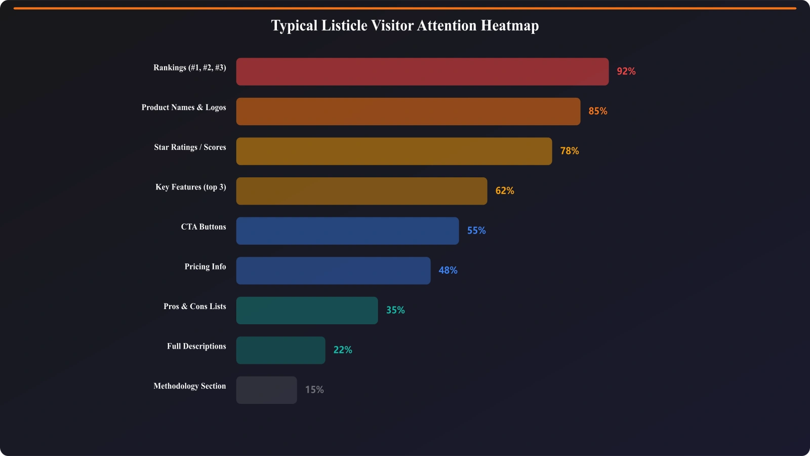
The vast majority of your visitors will never read your carefully crafted product descriptions. They're scanning. Jumping from headline to headline. Looking at rankings. Checking prices. Hunting for something specific.
Heatmap studies consistently show that listicle visitors follow an F-pattern initially, then shift to a jumping pattern once they identify interesting options. They might spend 30 seconds on your page but touch 15 different sections.
What this means for CRO: Every element needs to communicate value in under 2 seconds. Long paragraphs get skipped. Subtle design cues get missed. Be obvious.
The Three Intent Segments
Your listicle traffic isn't homogeneous. Based on behavior analysis, visitors typically fall into three buckets:
| Segment | Behavior | What They Need | Time on Page |
|---|---|---|---|
| Quick Deciders (35-40%) | Scan top 3-5 options, click fast | Clear winner, easy path to it | <30 seconds |
| Comparers (40-45%) | Scan full list, compare details | Comparison tables, feature details | 2-4 minutes |
| Deep Divers (15-20%) | Read full descriptions, check sources | Comprehensive information, trust signals | 5+ minutes |
The magic of great listicle CRO is serving all three segments with a single page structure. Quick Picks for the quick deciders. Scannable cards for the comparers. Rich descriptions for the deep divers. Layer them correctly and everyone finds what they need.
Exit Intent Patterns
Here's something most people miss: where visitors exit tells you what's broken. Common exit patterns and what they mean:
- Exit from top of page (0-20% scroll) →Above-fold content isn't compelling or relevant
- Exit after scrolling full list →Didn't find what they were looking for, or found it but you didn't convert
- Exit from a specific product section →That section is a dead end, needs better CTAs or content
- Exit after comparison table →Table helped them decide, but you lost them at the conversion point
Understanding these patterns lets you diagnose problems before implementing fixes. Don't optimize blindly—optimize based on where the actual leaks are.
Above-the-Fold Optimization
The first viewport is where you win or lose most visitors. Get this wrong and it doesn't matter how great the rest of your page is—they're gone.
The Five Things Your First Screen Must Do
In the first viewport, before any scroll, visitors need to understand:
- They're in the right place →The page matches their search intent
- The content is fresh →Date, update signals, current year
- The content is trustworthy →Author, expertise signals, methodology hint
- There's a quick path →Quick Picks or winner highlight visible
- There's depth available →TOC or list count that promises comprehensive coverage
Notice what's NOT on this list: your company branding, generic stock photos, walls of introductory text. Those are all conversion killers above the fold.
Critical Above-Fold Elements
Based on testing across hundreds of variations, here's what performs best above the fold:
- H1 with keyword →Clear, matches search intent exactly
- “Updated [Month Year]” badge →Freshness signal, 12-18% CTR lift in tests
- Quick Picks box →Top 3 recommendations immediately visible
- Scroll indicator →Visual cue that there's more below
- Sticky TOC trigger →Navigation that becomes sticky on scroll
What to push below the fold: lengthy intros, methodology explanations, author bios (keep a small byline), decorative images that don't add information.
For a deep dive specifically on above-fold optimization, check out Above the Fold: What to Show First on Listicles.
The Quick Picks Section
The Quick Picks section might be the single highest-impact CRO element on any listicle. Done right, it can capture 40-60% of your total conversions from just the first visible section of the page.
Why Quick Picks Work So Well
Remember that 35-40% of visitors who are “quick deciders”? They've already done research elsewhere. They're not looking for a deep dive—they want validation and a fast path forward.
Quick Picks gives them exactly that: “Here are the 3 best options, here's why, click here to get started.” Done. They're converted before they ever scroll.
But Quick Picks also serves the comparers and deep divers. It's a navigation tool, a preview of what's coming. It sets expectations for the rest of the page.
Optimal Quick Picks Structure
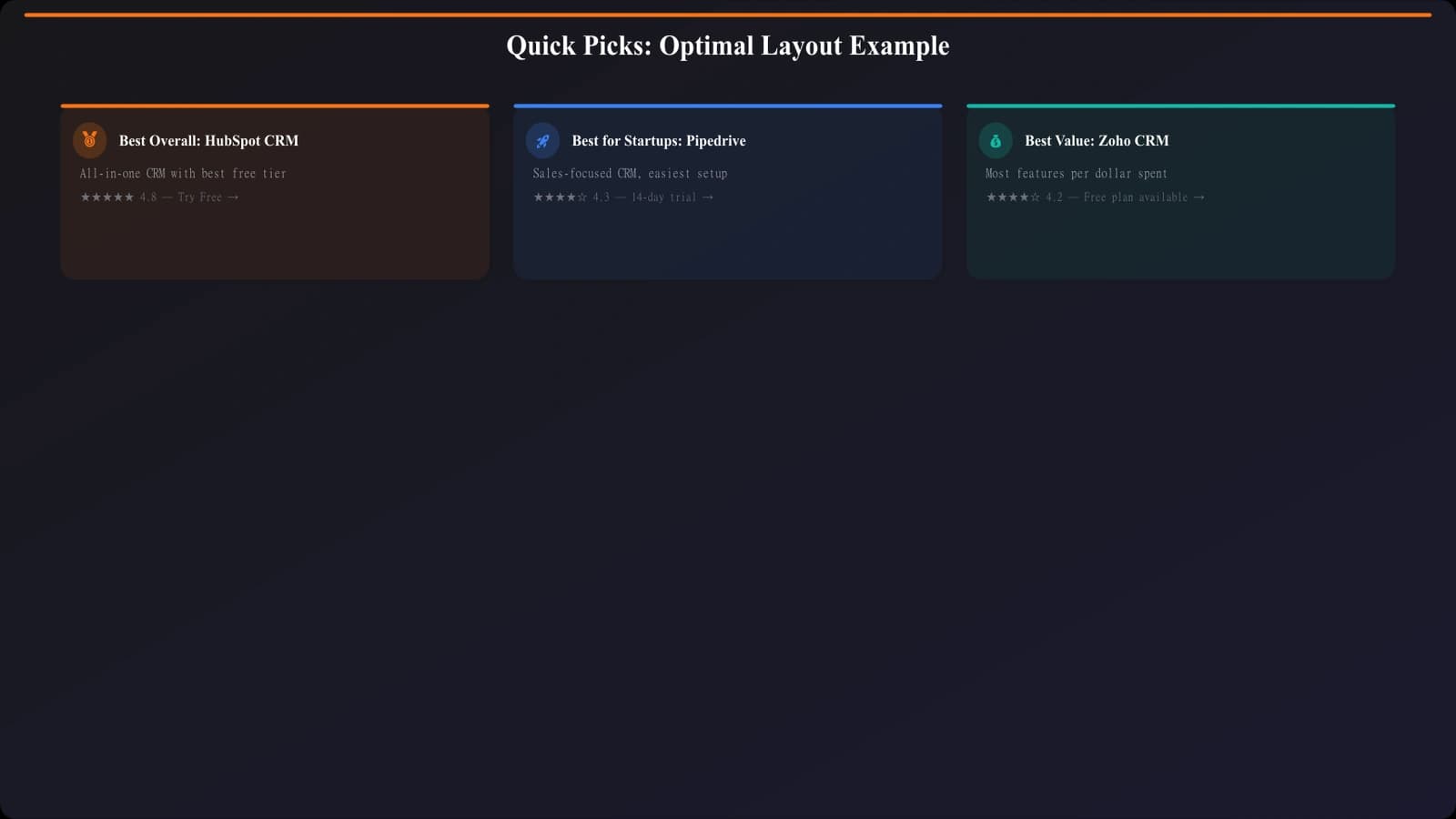
The most effective Quick Picks boxes follow this pattern:
- 3 picks maximum →More creates decision paralysis
- Clear category labels →“Best Overall,” “Best Value,” “Best for [Specific Use]”
- One-line value prop →Why this option won its category
- Key differentiator →Price, unique feature, or standout metric
- Single clear CTA →“Visit Site” or “Learn More”
| Element | Do This | Not This |
|---|---|---|
| Category labels | “Best for Small Teams” | “Our #2 Pick” |
| Value prop | “Most intuitive interface, free tier available” | “Great product with many features” |
| CTA | “Try Free” or “View Pricing” | “Click Here” or “Learn More” |
For the complete breakdown on designing Quick Picks that convert, see Quick Picks: Capture Impatient Visitors Instantly.
Product Card Design That Converts
Your product cards are where the actual comparison happens. Each card is a mini landing page competing for attention and clicks. The structure matters enormously.
Anatomy of a High-Converting Product Card
After testing hundreds of card variations, this hierarchy consistently performs best:
- Visual anchor →Logo or product screenshot (recognition + breaks up text)
- Product name + rank →Clear identification, optional badge for top picks
- One-sentence verdict →Your editorial take, the “so what”
- Key stats row →3-4 scannable metrics (price, rating, users, etc.)
- Pros/cons →3-4 bullets each, scannable format
- Primary CTA →Clear, action-oriented button
- Expandable detail →Full review hidden behind “Read More” for deep divers
Making Cards Scannable
The brutal truth: most of your visitors will scan your cards in under 3 seconds before moving on or clicking. Your card design needs to work at scan speed.
Key principles:
- Visual hierarchy through size →Product name biggest, verdict next, details smaller
- Whitespace between elements →Each piece of info needs breathing room
- Consistent placement →Price always in same spot, CTA always same location
- Icons for pros/cons →Green check, red X—universally understood
- No walls of text →If it's longer than 2 lines, hide it in an expandable
CTA Placement Within Cards
Where you put the CTA within each card matters more than you'd think. Two placements that work:
Option A: CTA at top of card (next to product name)
- Works when: Your audience makes fast decisions, brand recognition is high
- Pros: Catches quick deciders immediately
- Cons: Can feel pushy, lower engagement with card content
Option B: CTA after pros/cons (bottom of visible card area)
- Works when: Your audience needs convincing, decisions are considered purchases
- Pros: Users engage with content first, click with more conviction
- Cons: Some users never scroll to CTA
The right choice depends on your audience. For B2B software, Option B typically wins. For consumer products, Option A often performs better.
Generate Optimized Listicle Layouts
Create high-converting product cards and listicle structures automatically.
Try for FreeTrust Signals That Actually Matter
Here's where most listicles fail: they either have zero trust signals (feels like a content farm) or they overload with so many badges and certifications that nothing stands out (feels desperate).
The key is strategic placement of the right trust signals at the right moments.
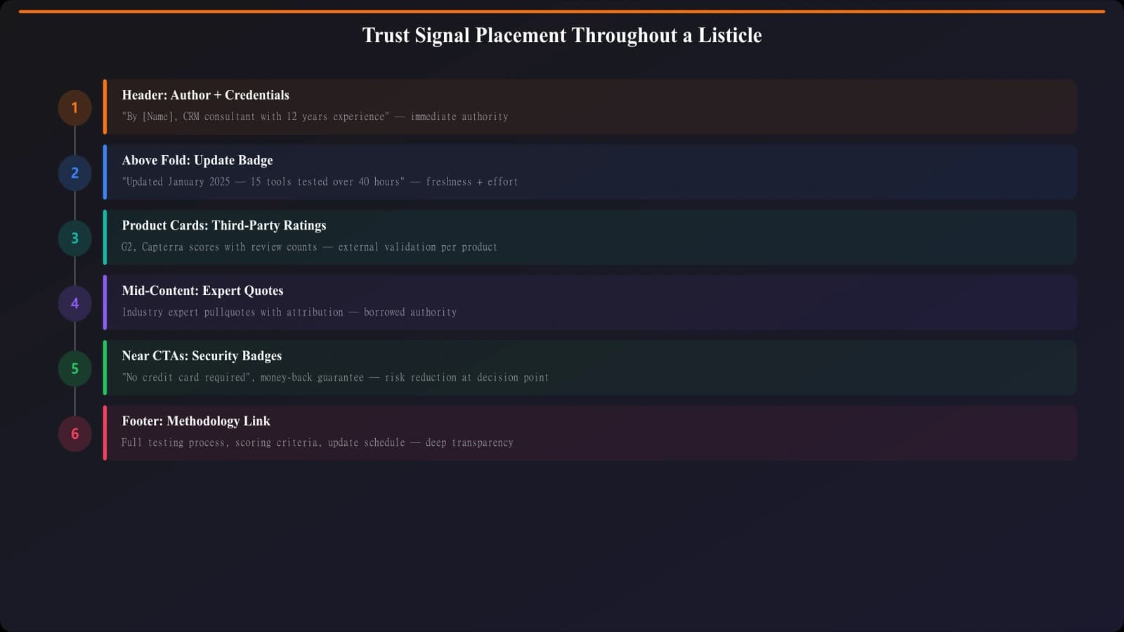
Types of Trust Signals for Listicles
| Type | Examples | Where to Use |
|---|---|---|
| Editorial credibility | Author expertise, methodology disclosure | Header area, expandable methodology section |
| Social proof | User counts, review ratings, testimonials | Within product cards, near CTAs |
| Third-party validation | G2/Capterra ratings, awards, certifications | Product cards, comparison tables |
| Freshness signals | “Updated [Date]”, “[N] products tested” | Above fold, page header |
| Transparency signals | Affiliate disclosure, testing methodology | Footer or expandable section |
Strategic Placement
Trust signals work best at decision points—moments where visitors are considering taking action. Those moments are:
- Above the fold →Should I trust this page at all?
- Quick Picks section →Can I trust these top recommendations?
- Individual product cards →Can I trust this specific product?
- Before CTAs →Is it safe to click this?
Don't scatter trust signals randomly—concentrate them at these decision points.
For the complete breakdown on which trust signals lift conversions and which don't, see Trust Signals That Actually Lift Conversions.
Sticky Elements: Navigation and CTAs
Sticky elements—navigation bars, floating CTAs, fixed sidebars—are controversial in listicle CRO. Done right, they improve usability and conversions. Done wrong, they annoy visitors and hurt engagement.
When Sticky Navigation Helps
A sticky table of contents or navigation bar works well when:
- Your list is long (10+ items) and visitors need to jump around
- The sticky element is compact and doesn't dominate the viewport
- It provides genuine utility, not just branding or CTAs
- It appears only after initial scroll (not on page load)
When Sticky CTAs Hurt
Floating CTA buttons and persistent banners often backfire because:
- They signal aggressive monetization (visitor trust drops)
- They cover content visitors are trying to read
- They feel like ads, triggering banner blindness
- On mobile, they eat precious viewport space
Mobile Considerations
Mobile viewports are tiny. Every sticky element competes with your actual content for attention. Best practices for mobile:
- Sticky nav only on scroll up →Disappears when scrolling down (reading), appears when scrolling up (navigating)
- No floating CTAs →Convert with in-content CTAs instead
- Slim headers →Maximum 50px height for sticky elements
- Easy dismiss →If you must have sticky elements, make them closeable
For the full testing data on when sticky elements help vs. hurt, check out Sticky Elements: When They Help vs Hurt Conversions.
Comparison Table Optimization
Comparison tables are conversion powerhouses—if designed correctly. They let comparers quickly evaluate multiple options side-by-side, accelerating decisions.
Comparison Table Dos
- Limit columns to 4-5 products →More creates overwhelm
- Lead with your recommendation →Put top pick in first column
- Use icons for yes/no features →Checkmarks and Xs scan instantly
- Highlight differentiators →Call out the rows where products actually differ
- Include CTAs in the table →Button row at bottom of each column
- Make it responsive →Horizontal scroll or stacked cards on mobile
Comparison Table Don'ts
- Don't include every feature →Focus on decision-relevant criteria only
- Don't use vague labels →“Good,” “Better,” “Best” without context
- Don't force identical column widths →Give more space to longer content
- Don't hide the table below the fold →Surface it early for comparers
Position your comparison table after your Quick Picks but before the detailed product cards. This serves comparers who want to see everything at once before diving into specifics.
CTA Strategy and Placement
The biggest CTA mistake on listicles? Treating all CTAs the same. Your page needs a layered CTA strategy that serves different visitor types and scroll depths.
The CTA Layers
| Layer | Location | Purpose | Style |
|---|---|---|---|
| Quick Picks CTAs | Above fold | Capture quick deciders | Prominent buttons, high contrast |
| Card CTAs | Each product card | Convert after evaluation | Consistent, not overwhelming |
| Table CTAs | Comparison table | Convert comparers | Compact buttons, one per product |
| End-of-page CTA | After last product | Catch undecided visitors | “Still deciding?” style helper |
CTA Copy That Works
Generic “Learn More” CTAs underperform specific, action-oriented alternatives:
- “Try Free” →When free tier exists, most effective
- “View Pricing” →For considered purchases, reduces friction
- “Start Trial” →When trial is the conversion goal
- “Get [Benefit]” →Outcome-focused (“Get Organized”)
Avoid: “Click Here,” “Learn More,” “Read Review,” “Buy Now” (too aggressive for research-mode visitors)
Affiliate Disclosure Placement
If you're using affiliate links, disclosure is legally required and ethically important. But placement matters:
- Do: Brief disclosure at top of page, full disclosure in footer or dedicated section
- Do: Matter-of-fact language (“We earn commissions from links on this page”)
- Don't: Apologetic language that undermines trust
- Don't: Repeat disclosure at every CTA (once at top is sufficient)
Testing and Iteration Framework
CRO isn't a one-time project—it's an ongoing process. Here's how to systematically improve your listicle conversions over time.
What to Test First
Prioritize tests by potential impact and ease of implementation:
- Quick Picks presence/absence →Highest impact, easy test
- CTA copy variations →Moderate impact, very easy test
- Product card structure →Moderate impact, moderate effort
- Above-fold content →High impact, requires careful design
- Sticky elements →Variable impact, easy to test
Metrics That Matter
Don't just track click-through rates. Build a complete picture:
- Scroll depth →Are visitors engaging with the full page?
- Time on page by segment →Different for quick deciders vs. deep divers
- Click distribution →Which products get clicks? Which CTAs?
- Bounce rate vs. scroll →Are non-scrollers bouncing?
- Conversion rate by entry point →Different for organic vs. direct vs. social
Getting to Statistical Significance
Listicles often don't have enough traffic for traditional A/B testing. Alternatives:
- Sequential testing →Run version A for 2 weeks, version B for 2 weeks, compare
- Cross-page learning →Test on high-traffic pages, apply learnings to lower-traffic ones
- Qualitative feedback →Session recordings, user surveys for directional insights
Building Your CRO Roadmap
Listicle CRO isn't about tricks or hacks. It's about understanding how visitors actually use your content and removing friction from their journey. Every element—Quick Picks, product cards, trust signals, CTAs—should make decisions easier, not pressure visitors into clicking.
Here's your action plan:
- Audit your current pages →Where do visitors drop off? What's missing above the fold?
- Implement Quick Picks →Highest-impact single change for most listicles
- Optimize product cards →Scannable structure, clear hierarchy, strategic CTA placement
- Add strategic trust signals →At decision points, not scattered randomly
- Build comparison tables →For pages with 5+ products being compared
- Test and iterate →Start with high-impact tests, build a continuous optimization habit
The supporting articles in this series go deep on specific elements:
- Above the Fold: What to Show First on Listicles
- Quick Picks: Capture Impatient Visitors Instantly
- Trust Signals That Actually Lift Conversions
- Sticky Elements: When They Help vs Hurt Conversions
Start with the Quick Picks implementation—that single change often delivers 20-30% conversion lifts. Then work through the rest of the framework systematically. Your listicles will go from traffic magnets to conversion machines.
Product Manager at BestPage. Pioneer in AEO research since 2024, exploring the convergence of SEO and GEO (Generative Engine Optimization). Led multiple AI-powered content optimization projects that achieved 300%+ citation increases in ChatGPT and Perplexity.