
I've seen listicle pages with so many trust badges they look like a NASCAR vehicle. Security seals, award badges, certification logos, star ratings from six different platforms—all crammed together in a desperate bid to look credible.
Here's the uncomfortable truth: most of those badges do nothing for conversions. Some actually hurt. Visitors have developed sophisticated filters for identifying generic trust theater, and when they detect it, their guard goes up instead of down.
The trust signals that actually work on comparison pages are specific, relevant, and strategically placed. They answer questions visitors are already asking: “Is this information current? Is this source credible? Can I trust these recommendations?”
This guide covers which trust signals matter for listicles and comparison pages, where to place them for maximum impact, and how to avoid the common mistakes that make your page look like a scam instead of a resource. For the complete conversion optimization framework, see our CRO for Listicles guide.
The Psychology of Trust on Comparison Pages
Before diving into specific signals, let's understand why trust matters differently on comparison pages than on other page types.
When someone lands on your listicle, they're in research mode. They're evaluating not just the products you're comparing—they're evaluating you as a source. And they're doing this in seconds, subconsciously, before they ever read a word of your actual content.
The Trust Questions Visitors Are Asking
Every visitor runs through a mental checklist, usually without even realizing it:
- “Is this page current?” →Outdated comparison pages are worse than useless. Products change, pricing changes, features change. If your page looks stale, visitors assume the information is wrong.
- “Does the author actually know this space?” →Generic content farms rank for everything but understand nothing. Visitors are looking for signals that you have genuine expertise.
- “Is this objective or just a sales pitch?” →Affiliate content has a credibility problem. Visitors want to know if you're giving honest evaluations or pushing whatever pays the highest commission.
- “Can I trust these product claims?” →Your recommendations are only as trustworthy as your sources. Third-party validation helps.
Effective trust signals answer these questions before they're consciously asked. Ineffective trust signals—generic badges, irrelevant certifications, excessive self-promotion—fail to address what visitors actually care about.
Trust vs. Credibility vs. Authority
These terms get used interchangeably, but they're actually different things:
| Concept | What It Means | How to Signal It |
|---|---|---|
| Trust | Visitor believes you won't deceive them | Transparency, disclosure, consistency |
| Credibility | Visitor believes you know what you're talking about | Expertise signals, methodology, depth |
| Authority | Visitor believes you're a recognized source | Brand recognition, backlinks, citations |
You need all three, but they're built differently. A new site can have trust (through transparency) before it has authority (which takes time). Focus on what you can control immediately.
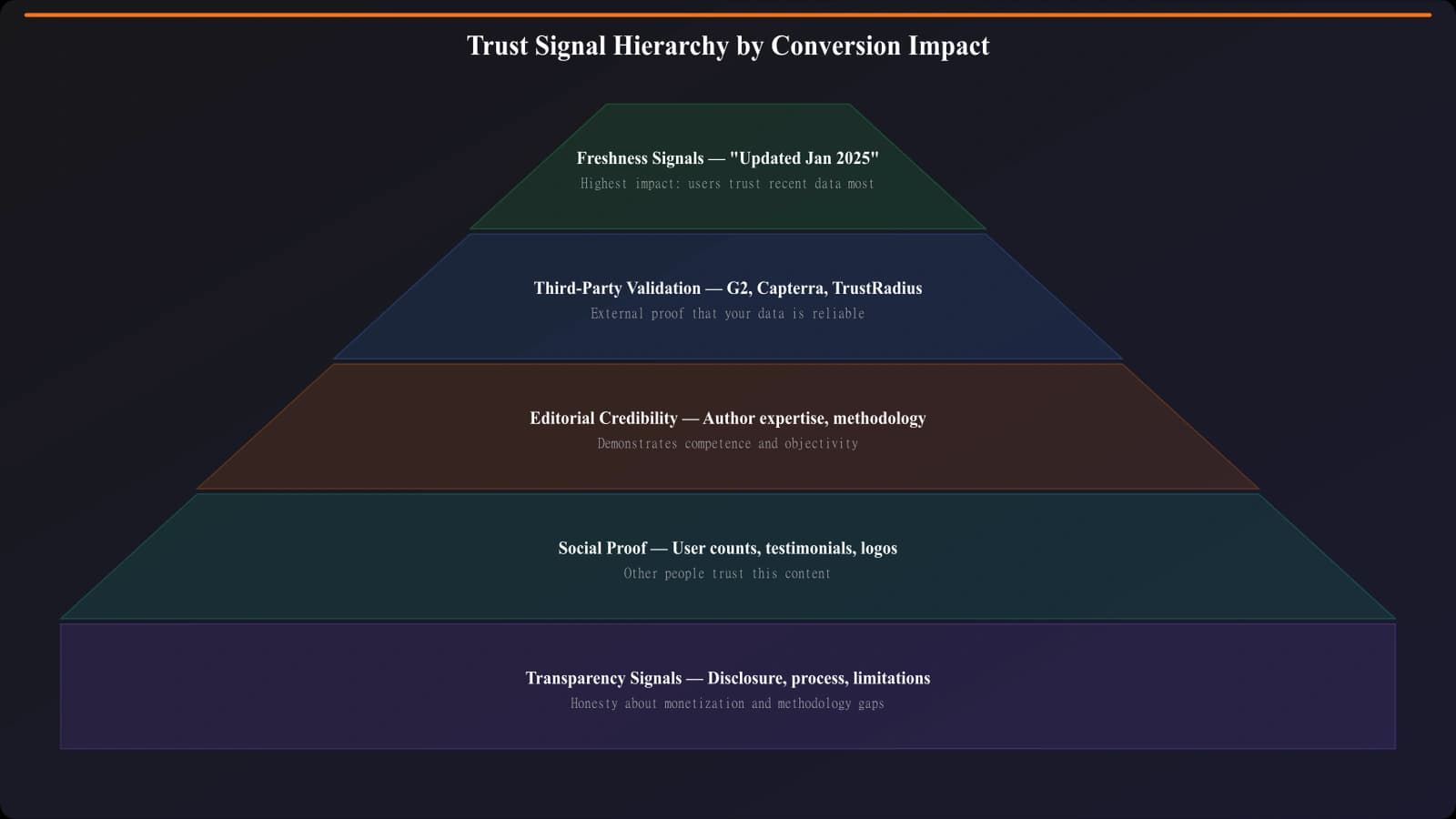
Freshness Signals: The Highest-Impact Trust Element
Of all the trust signals we've tested, freshness indicators have the most consistent positive impact on listicle conversions. And it makes sense—visitors are terrified of making decisions based on outdated information.
Types of Freshness Signals
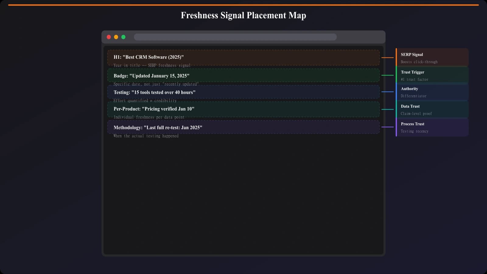
“Updated [Month Year]” badge →This is the single most effective trust signal for comparison pages. Place it prominently above the fold, near your H1. In testing, pages with visible update dates see 12-18% higher engagement than identical pages without them.
“Last reviewed [Date]” →Slightly more specific than “updated,” this signals that someone actually looked at the content recently, not just changed a word to trigger an update.
“[Number] products tested for this guide” →Communicates thoroughness and suggests ongoing research. “47 CRMs tested” is more credible than just listing 10.
Year in title →“Best CRM Software 2026” immediately signals currency. But be careful—you need to actually update the page when you update the year.
Placement Best Practices
- Above the fold →Update date should be visible without scrolling
- Near the H1 →Close association with the main content
- In product cards →“Pricing verified [Month Year]” for individual products
- NOT in fine print →If visitors can't find it easily, it doesn't build trust
Third-Party Validation: Borrowed Trust
Third-party validation is powerful because it's not you saying you're good—it's someone else. This borrowed trust carries more weight than self-promotion ever could.
Third-Party Signals That Work
G2 and Capterra ratings →These platforms have become the trusted source for B2B software reviews. Including G2 ratings in your product cards provides instant third-party validation. The data is verifiable—visitors can click through and confirm.
User/customer counts →“50,000+ businesses use this product” is social proof that doesn't require you to be the one making claims. Pull these from the product's own site or press releases.
Industry awards (relevant ones) →A “Best CRM for Small Business - TechCrunch 2025” badge is meaningful. A generic “Fastest Growing Company” badge that every company seems to have is not.
Expert testimonials →Quotes from recognized experts in the space, with attribution. Not generic “Great product!” quotes from unknown reviewers.
Third-Party Signals That Don't Work
Generic badges →“As seen on” logos, generic security seals, industry association memberships that every company has. These are so common that visitors filter them out automatically.
Bought certifications →Badges from organizations that exist primarily to sell badges. Visitors can often tell, and it backfires.
Outdated recognition →An award from 2019 doesn't help in 2026. If you're showcasing third-party validation, it needs to be current.
Generate Listicles With Built-In Trust
Create comparison pages with proper trust signal placement from the start.
Try for FreeEditorial Credibility: Showing Your Work
Editorial credibility signals communicate that there's a real person with real expertise behind the content. In an era of AI-generated content farms, this matters more than ever.
Author and Expertise Signals
Author bylines with photos →A real name and face makes content feel human. Generic “by Staff” or no attribution reads as content farm.
Author credentials →“10 years in CRM implementation” or “Former Salesforce product manager” builds credibility. But only include credentials that are actually relevant to the topic.
LinkedIn or Twitter links →Letting visitors verify the author is real. This is increasingly important as AI content proliferates.
Methodology Transparency
How we evaluate →A brief section explaining your review criteria. “We tested each CRM with a team of 5 for 2 weeks, focusing on ease of use, integrations, and value for money.”
Testing details →Screenshots, videos, or specific observations from actual use. This is what separates real reviews from aggregated specs.
Comparison criteria →Why these products? Why this ranking? Transparency about your selection process builds confidence in your conclusions.
Where to Place Editorial Signals
- Author byline →Near the title, visible without scrolling
- Methodology section →Expandable/collapsible near the top, or brief summary in intro with link to full methodology
- Author bio →At the end of the article, more detailed
Transparency Signals: The Counter-Intuitive Trust Builder
Here's something that seems counterintuitive but consistently works: being upfront about your commercial interests actually increases trust.
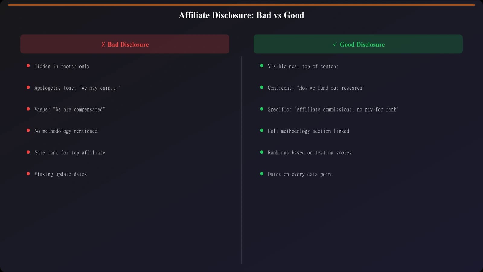
Affiliate Disclosure Done Right
Most visitors assume affiliate content exists. Pretending otherwise—or burying disclosures in fine print—reads as deceptive. A clear, matter-of-fact disclosure at the top of the page actually increases trust.
Good example: “We earn commissions from some links on this page. This doesn't affect our rankings—see our methodology.”
Bad example: No disclosure, or 8-point font at the bottom of the page that no one reads.
Also bad: Over-apologetic disclosures that draw excessive attention to the commercial aspect. Keep it brief and confident.
Acknowledging Limitations
Perfect pages are suspicious pages. Including a few honest limitations→ldquo;We haven't tested the new release yet” or “Our team focuses on SMB use cases”—actually increases credibility by making your claims seem more honest.
This is counterintuitive for most marketers, who are trained to put the best foot forward always. But for educational content, selective honesty about limitations builds the credibility that makes your positive claims more believable.
Strategic Placement: Trust Signals at Decision Points
The biggest mistake with trust signals is scattering them randomly throughout the page. Trust signals work best when concentrated at decision points—moments where visitors are considering taking action.
The Four Key Decision Points
1. Above the fold (Page-level trust)
- What to place: Freshness date, author byline, brief methodology hint
- Purpose: Convince visitors to stay and engage
2. Quick Picks section (Recommendation trust)
- What to place: “Editor's pick” badge, brief “why this won” statement
- Purpose: Validate your top recommendations immediately
3. Individual product cards (Product trust)
- What to place: G2/Capterra ratings, user counts, “pricing verified” dates
- Purpose: Build confidence in specific product recommendations
4. Near CTAs (Action trust)
- What to place: Security signal if relevant, “official site” indicator
- Purpose: Remove friction from the final click
Avoiding Trust Signal Overload
More is not better. When every square inch of your page has a badge or seal, visitors tune out all of them. Worse, it can make your page look desperate or scammy.
Rules of thumb:
- 1-2 trust signals above the fold →Maximum. Don't crowd the hero area.
- 1-2 per product card →Usually rating + user count is enough
- 0-1 near each CTA →Often none is fine if page-level trust is established
- Remove any badge you can't explain why it matters
Building a Trust Architecture That Works
Trust isn't built with badges—it's built with transparency, expertise, and relevance. The signals that actually lift conversions are the ones that answer visitors' real questions: Is this current? Is this credible? Is this honest?
Here's your trust signal checklist:
- Add freshness signals →Visible update date above the fold, always accurate
- Include third-party validation →G2/Capterra ratings, user counts in product cards
- Establish editorial credibility →Real author, relevant expertise, methodology transparency
- Be upfront about commercial interests →Brief, confident affiliate disclosure
- Concentrate at decision points →Above fold, product cards, near CTAs
- Remove anything that doesn't add value →Generic badges actively hurt
For the complete conversion optimization framework that puts these trust signals in context, see CRO for Listicles: Complete Conversion Guide. And for related elements, check out Above the Fold: What to Show First on Listicles.
Product Manager at BestPage. Pioneer in AEO research since 2024, exploring the convergence of SEO and GEO (Generative Engine Optimization). Led multiple AI-powered content optimization projects that achieved 300%+ citation increases in ChatGPT and Perplexity.