
A typical “10 best tools” comparison might include a hero image, 10 product screenshots, 10 product logos, comparison graphics, and promotional banners. That's 20+ images on a single page—and each is a potential performance problem. Multiply across a programmatic library of hundreds of comparison pages, and poor image optimization becomes a site-wide Core Web Vitals failure.
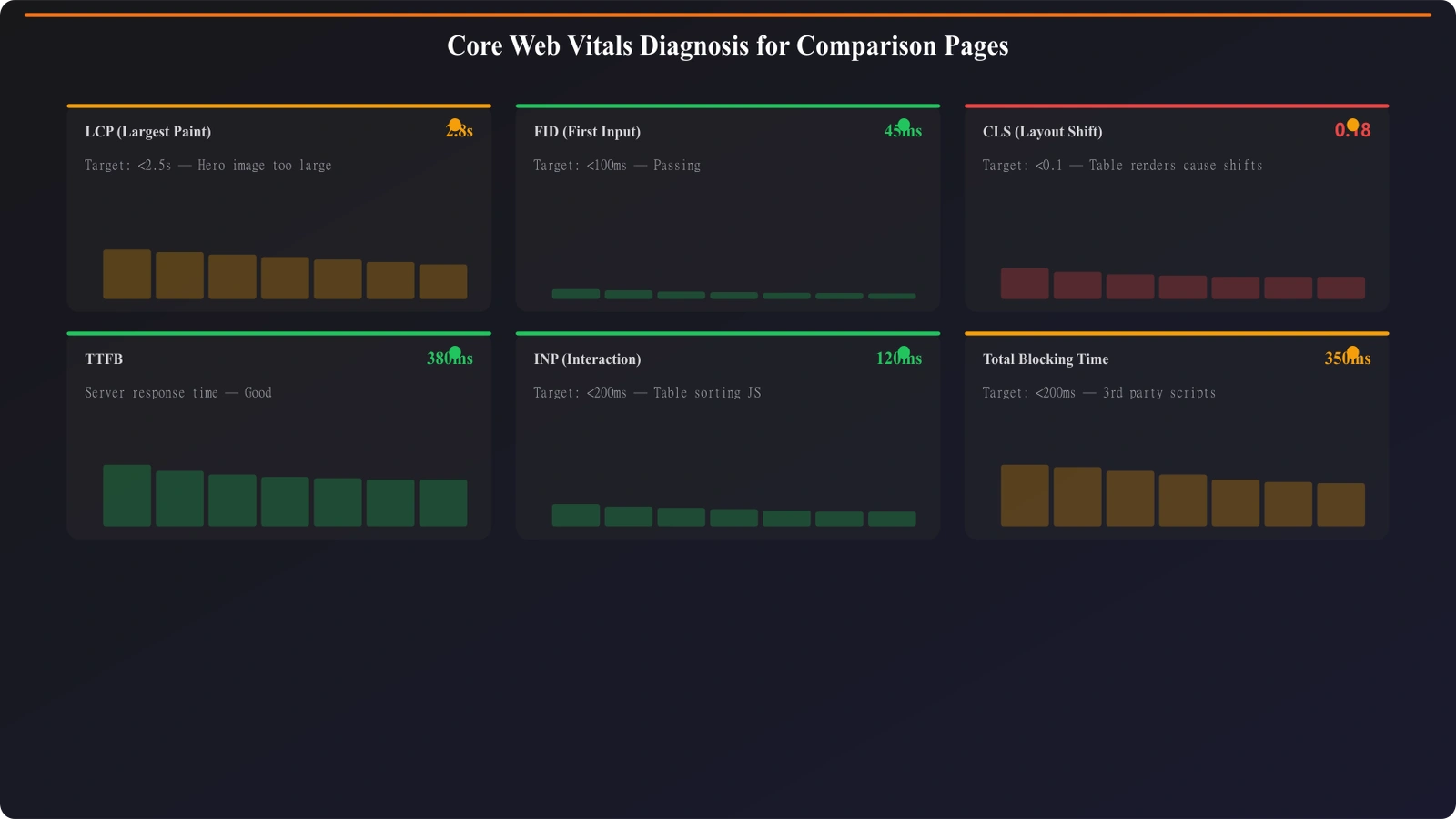
The three Core Web Vitals—LCP (loading), INP (interactivity), and CLS (visual stability)—each present specific challenges for image-heavy content. LCP suffers when large hero images load slowly. CLS fails when images load without reserved space, causing content to jump. Even INP can suffer if images trigger heavy JavaScript processing.
This guide covers practical optimization for comparison page images. The goal is passing Core Web Vitals thresholds while maintaining the visual richness that makes comparison content useful.
LCP Optimization for Listicles
Largest Contentful Paint measures when the largest visible element finishes rendering. For comparison pages, the LCP element is usually the hero image or the first product screenshot.
Hero Image Priority
The hero image is typically your LCP element. Optimize it aggressively:
- Preload the hero: Add rel=“preload” for the hero image in the document head
- Use priority loading: In frameworks like Next.js, set priority=true on hero images
- Optimize dimensions: Serve exactly the size needed, not larger
- Modern formats: Use WebP or AVIF with JPEG fallback
- Adequate compression: Quality 80-85 is usually sufficient; test visual difference
- CDN delivery: Serve from a CDN close to users
For programmatic pages, hero image optimization becomes template-level work. Get the hero loading pattern right in your template, and it applies across all generated pages.
Above-the-Fold Content
Identify what's visible without scrolling and prioritize those images:
- Hero image (always priority)
- First 1-2 product logos if visible above fold
- Any comparison graphics in the intro section
Everything below the fold should be lazy loaded. Native lazy loading (loading=“lazy”) is sufficient for most cases and doesn't require JavaScript.
Preventing Layout Shift
Cumulative Layout Shift measures unexpected content movement. Images are the #1 cause of CLS problems on comparison pages.
Explicit Image Dimensions
Every image must have explicit width and height attributes or CSS aspect-ratio:
- HTML attributes: Add width and height to every img tag
- CSS aspect-ratio: Use aspect-ratio property for responsive sizing
- Container sizing: Set dimensions on image containers if images are background
- Consistent sizes: For product screenshots, use consistent dimensions across all products
When browsers know image dimensions before loading, they reserve the correct space. No shift occurs when the image arrives.
Logo Size Standardization
Product logos are particularly problematic—they come in different aspect ratios and sizes. Standardize display:
Logo handling approach:
• Create a fixed-size logo container (e.g., 120x60px)
• Center logos within the container using object-fit: contain
• The container reserves space; logo dimensions don't affect layout
• Process logos to consistent sizes during asset pipeline
This approach ensures layout stability regardless of original logo dimensions.
Dynamic Content Slots
If images load dynamically (e.g., from API data), reserve space before data arrives:
- Use skeleton placeholders with correct dimensions
- Set min-height on containers that will receive images
- Avoid layouts that depend on image presence vs absence
The key principle: browser should know exactly where everything will be before images load.
Image Format Strategy
Choosing the right image format significantly impacts file size and loading speed.
Format Selection Guide
Different image types warrant different formats:
- Product screenshots: WebP with quality 80-85; usually complex scenes with gradients
- Product logos: SVG when available; PNG for raster logos; WebP as fallback
- Hero images: WebP or AVIF with quality optimization; these are worth extra compression effort
- Icons and simple graphics: SVG for scalability and tiny file size
- Photographs: WebP or AVIF; JPEG fallback for older browsers
Implement format selection in your build pipeline so correct formats are generated automatically from source images.
Responsive Image Delivery
Serve different sizes for different viewports:
Responsive image implementation:
• Use srcset to specify multiple image sizes
• Use sizes attribute to tell browsers which size to select
• Generate 2-3 size variants (mobile, tablet, desktop)
• Don't over-generate—3 variants typically sufficient
• Use image CDN for on-the-fly resizing if available
For PSEO, responsive image generation becomes part of your asset pipeline. Generate variants when processing source images, not at request time.
Generate Performance-Optimized Listicles
Create comparison pages with image optimization best practices built in.
Try for Free
Measurement and Monitoring
Optimization without measurement is guesswork. Establish measurement practices.
Field vs Lab Data
Understand the difference in Core Web Vitals data sources:
- Lab data: Simulated tests (Lighthouse, PageSpeed Insights). Useful for debugging but doesn't reflect real user experience.
- Field data: Real user metrics from Chrome UX Report. This is what Google uses for ranking signals.
Aim to pass both, but field data is what ultimately matters. A page might score well in lab tests but fail in field data if real users have different conditions.
PSEO-Specific Monitoring
For programmatic sites with many pages, monitor strategically:
- Template sampling: Monitor representative pages from each template type
- High-traffic monitoring: Focus on pages with significant traffic
- Automated testing: Include Lighthouse in CI/CD to catch regressions
- Search Console monitoring: Check Core Web Vitals report for page group performance
You can't individually monitor thousands of pages, but if templates are consistent, sample monitoring catches systemic issues.
Performance as Foundation
Core Web Vitals optimization for image-heavy content isn't optional—it's foundational to SEO success. Google explicitly uses these metrics as ranking signals. Poor performance affects both user experience and search visibility.
For PSEO sites, the leverage is significant: optimizations in templates apply across all generated pages. Invest in getting image handling right at the template level, and your entire programmatic library benefits.
For lazy loading implementation, see Lazy Loading Tables Without Killing Crawlability. For general technical audits, see Technical Audit Checklist.
Product Manager at BestPage. Pioneer in AEO research since 2024, exploring the convergence of SEO and GEO (Generative Engine Optimization). Led multiple AI-powered content optimization projects that achieved 300%+ citation increases in ChatGPT and Perplexity.