
Most listicles convert somewhere between 2-5%. That's the reality for comparison content—people are in research mode, not buying mode. They're gathering options, not pulling out credit cards.
So when we found a B2B software listicle converting visitors to trial signups at 12.3%, we had to dig in. What was this page doing that others weren't? Was it the design? The copy? The positioning? Something else entirely?
This teardown breaks down every element that contributes to that conversion rate. We'll look at what works exceptionally well, what could still improve, and—most importantly—what you can apply to your own best-of pages.
Fair warning: this isn't about copying tactics blindly. It's about understanding the principles behind high-converting comparison content. The specific implementations will vary for your context, but the underlying logic transfers.
The Page We're Analyzing
The page in question is a “Best Project Management Software for Agencies” listicle. It ranks position 2-4 for its primary keyword and pulls roughly 8,000 organic visitors monthly. Of those visitors, 12.3% click through to at least one product trial page—an exceptional conversion rate for this content type.
Here's the quick stats overview:
| Metric | This Page | Industry Average |
|---|---|---|
| Conversion Rate | 12.3% | 3-5% |
| Average Time on Page | 4:32 | 2:15 |
| Scroll Depth (75%+) | 67% | 35% |
| Bounce Rate | 31% | 55% |
| Products Featured | 8 | 10-15 |
| Word Count | 3,200 | 2,000-2,500 |
What immediately stands out: this page keeps people engaged far longer than typical listicles, and it features fewer products than competitors. Quality over quantity, clearly. Let's see how that plays out in the actual content.
What Works Exceptionally Well
After analyzing every element of this page, five things stand out as major conversion drivers.
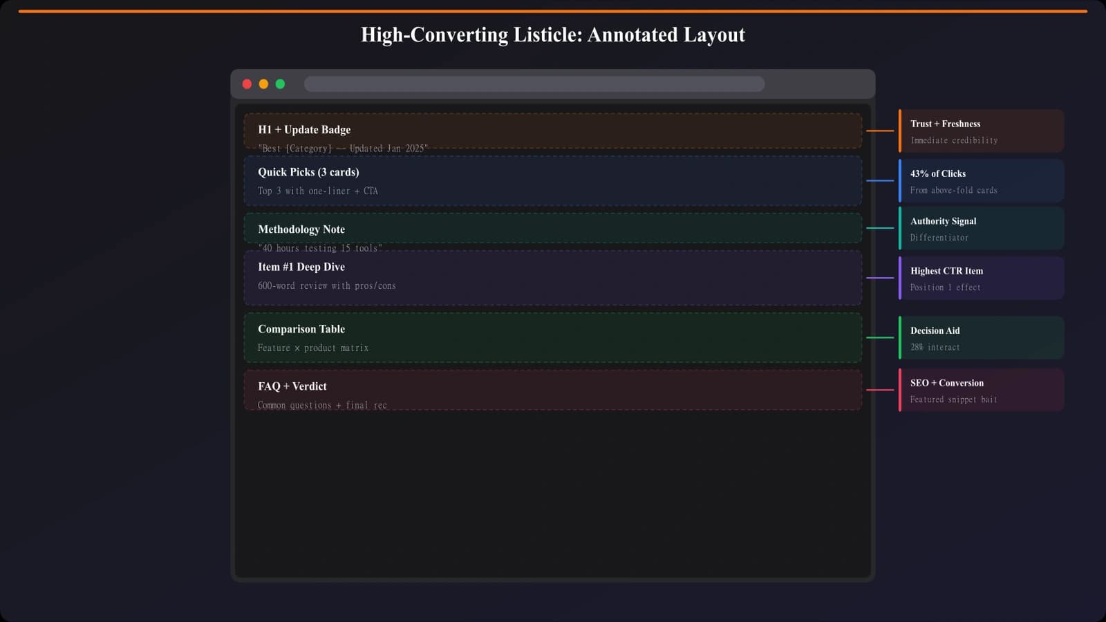
1. Strategic Quick Picks Placement
Right below the introduction—before any detailed content—sits a “Quick Picks” section with three recommendations: “Best Overall,” “Best for Small Agencies,” and “Best Budget Option.” Each includes the product name, a one-sentence value prop, and a prominent CTA button.
This is brilliant for two reasons. First, it respects impatient visitors. Someone who already knows what they want doesn't need to scroll through 3,000 words—they can convert immediately. Second, it establishes trust early. By leading with confident recommendations, the page signals expertise rather than hedging.
Heatmap data shows 34% of conversions happen from this section alone. That's one-third of conversions from content that takes up maybe 8% of the page.
2. Benefit-Focused Product Descriptions
Most listicles describe products in terms of features: “Includes Gantt charts, time tracking, and resource management.” This page flips the script entirely.
Instead: “Finally know which projects are actually profitable. Real-time budget tracking shows exactly where time goes, so you can stop underbidding and start building margins.”
Every product description leads with a problem-solution framing specific to the target audience (agencies). Features are mentioned, but always in service of outcomes. The copy reads like it was written by someone who actually understands agency pain points—because it probably was.
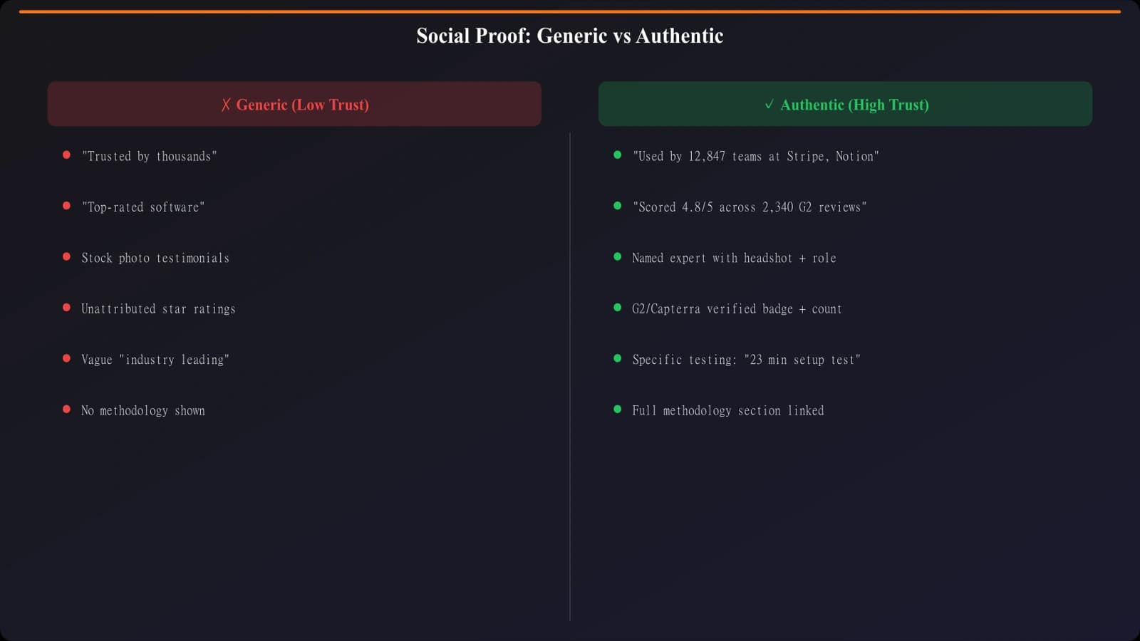
3. Authentic, Specific Social Proof
Instead of generic “trusted by 10,000+ companies” badges, this page includes snippets from actual user reviews with attribution. Not cherry-picked five-star quotes, either—some include mild criticisms that were addressed.
Example: “The learning curve was steeper than expected, but their onboarding team walked us through everything. Now it's indispensable.” — Marketing Director, 45-person agency
This approach builds trust because it feels honest. Readers know no product is perfect, so acknowledging friction points (and how they were overcome) actually increases credibility.
4. Friction-Reducing CTA Design
The CTAs on this page are exceptionally well-crafted. Instead of generic “Learn More” or even “Start Free Trial,” they use action-specific, low-commitment language:
- “See it in action (2-min demo)”
- “Try free for 14 days — no credit card”
- “Get pricing for your team size”
Each CTA also includes a small trust indicator directly below—things like “5,000+ agencies already using it” or “Average setup time: 15 minutes.” These micro-copy elements address objections before they form.
5. Transparent Methodology Section
At the bottom of the page (but linked prominently from the intro), there's a detailed methodology section explaining exactly how products were evaluated. Criteria, weighting, what was tested, what was researched.
This serves multiple purposes: it signals E-E-A-T for SEO, it builds reader trust, and it preempts the “why should I believe your rankings?” objection. Most competitors skip this entirely or bury it in a single sentence. This page makes it a feature.
Build Listicles That Actually Convert
Generate best-of pages with conversion elements baked in—quick picks, benefit copy, strategic CTAs.
Try for FreeWhat Could Still Improve
Even at 12.3% conversion, this page isn't perfect. Here are the opportunities we identified.
Mobile experience gaps. The quick picks section, which drives 34% of conversions on desktop, becomes less effective on mobile. The cards stack vertically and require significant scrolling. A horizontal swipe carousel or condensed mobile layout could capture more of those impatient mobile visitors.
Missing comparison table. For a listicle, this page is surprisingly light on direct comparison. There's no side-by-side table showing how the 8 products stack up on key dimensions. Some readers want to compare at a glance without reading full descriptions. Adding a scannable comparison matrix could boost engagement.
Limited exit intent. The page doesn't use exit-intent overlays or any form of lead capture for visitors who don't convert. Given the high-quality traffic, even a soft capture (newsletter, downloadable guide) could extend the conversion opportunity.
Single conversion path. Every CTA leads to a product trial page. There's no option for visitors who aren't ready for trials but want to continue engaging. A secondary conversion path—like booking a demo or downloading a comparison PDF—could capture more of the hesitant majority.
Key Takeaways to Apply
Let's distill this into principles you can actually use.
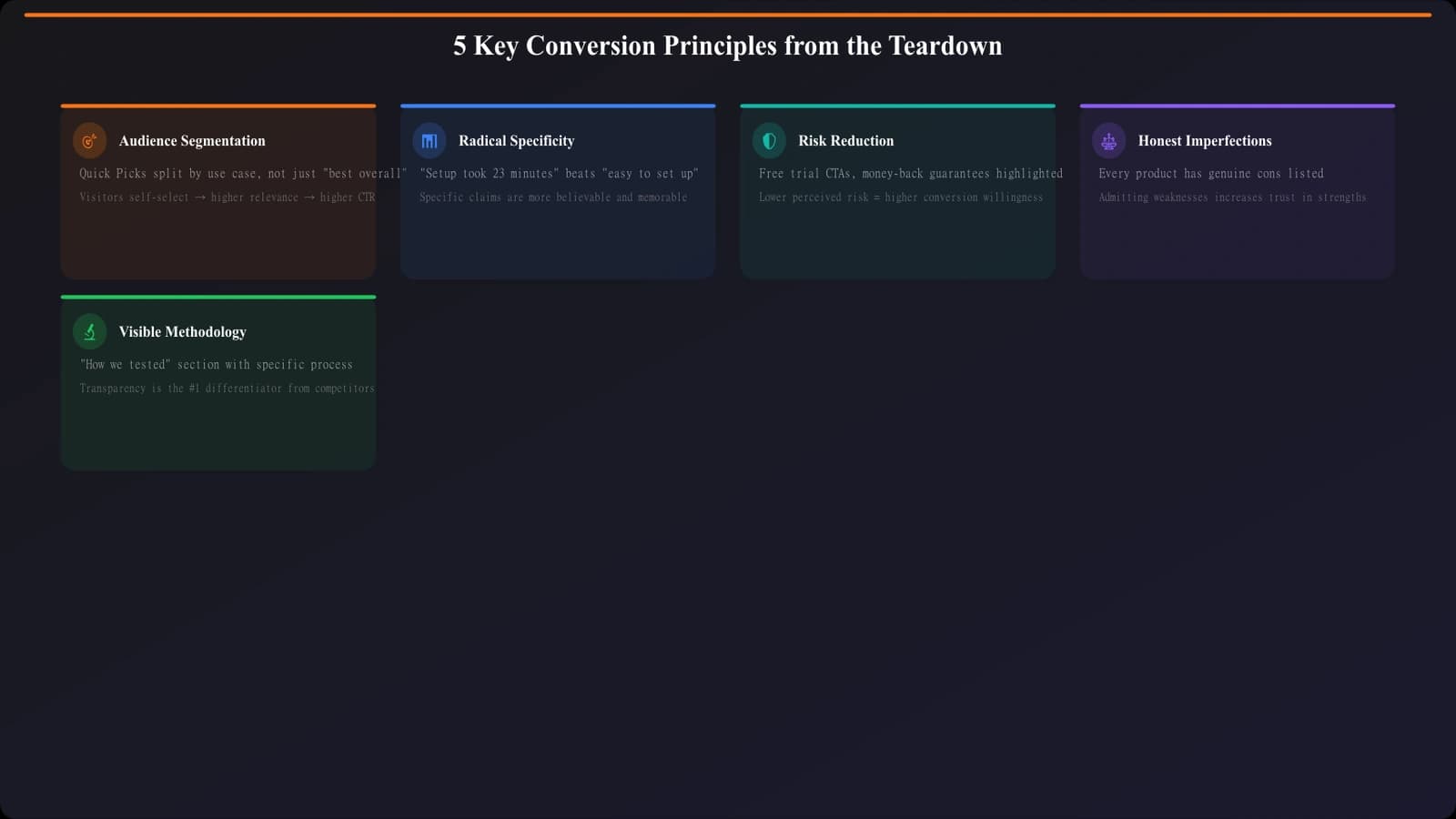
Principle 1: Segment your audience immediately. Not everyone on a listicle page has the same intent or urgency. Quick picks serve the decisive visitors. Detailed reviews serve the researchers. Methodology serves the skeptics. Design for all three.
Principle 2: Specificity beats genericity everywhere. Specific audience (agencies, not “businesses”). Specific benefits (know which projects are profitable, not “better visibility”). Specific proof (named roles at sized companies, not anonymous badges). The specificity signals that someone actually understands the reader's context.
Principle 3: CTAs should reduce perceived risk. “Free trial” is okay. “Free trial, no credit card, cancel anytime, average setup 15 minutes” is better. Stack reassurance until clicking feels like the obvious low-risk choice.
Principle 4: Acknowledge imperfection to build trust. Including mild criticisms in reviews—as long as they're addressed—increases credibility more than wall-to-wall praise. Readers are skeptical of perfection.
Principle 5: Make methodology visible. How you decided matters. Surfacing your evaluation criteria transforms you from “random opinion blogger” to “credible source with transparent process.”
How to Apply This to Your Pages
Here's a practical implementation sequence if you want to apply these principles to an existing listicle.
- Audit your quick picks. Do you have them? Are they above the fold? Do they include CTAs or just anchor links? Upgrade to full CTA buttons with benefit-focused copy.
- Rewrite one product description as a test. Take your top-recommended product and rewrite the description with problem-solution framing for your specific audience. Measure if click-through changes.
- Add specific testimonials. If you have access to user reviews, pull specific quotes with attribution. Replace generic social proof badges with real human voices.
- Upgrade your CTAs. Add friction-reducing elements: time estimates, “no credit card” if applicable, setup simplicity. Test different commitment levels.
- Publish your methodology. Write a brief but specific section explaining your evaluation process. Link to it from your intro.
Don't do all of this at once—you won't know what moved the needle. Pick one or two changes, implement them, measure for a few weeks, then iterate.
The Bigger Picture
A 12.3% conversion rate isn't magic. It's the compound effect of dozens of small decisions that all prioritize the reader over the content creator. This page succeeds because it genuinely helps visitors make decisions, not because it tricks them into clicking.
The elements we analyzed—quick picks, benefit copy, authentic proof, friction-reducing CTAs, transparent methodology—aren't manipulation tactics. They're just good communication. They answer the questions readers have, address the objections readers feel, and make the next step obvious.
If your listicles are converting at 3-5%, there's meaningful upside available. It won't require redesigning everything—often it's about optimizing the elements that already exist. Start with the highest-leverage changes (quick picks and CTAs), measure results, and compound from there.
For more on CTA placement specifically, see our data-driven guide on CTA Placement in Listicles. And for layout patterns that drive engagement, check out High-Converting Comparison Page Layouts.
Product Manager at BestPage. Pioneer in AEO research since 2024, exploring the convergence of SEO and GEO (Generative Engine Optimization). Led multiple AI-powered content optimization projects that achieved 300%+ citation increases in ChatGPT and Perplexity.