
Layout matters more than most content creators realize. You can have brilliant copy, accurate data, and genuine expertise—but if the layout fights against the user's natural reading patterns, conversions suffer. People won't read what they can't easily scan.
Over the past year, we've analyzed hundreds of comparison pages across different niches. Some convert at 10%+. Others struggle to break 2%. The content quality difference between them often isn't dramatic. What is dramatic? The layout.
This guide presents 12 layout patterns that we've seen work consistently across high-converting comparison content. Each pattern solves a specific user need—quick decisions, deep research, mobile scanning, side-by-side analysis. Mix and match based on your audience and content type.
For conversion optimization beyond layout, see our teardown of a 12% converting listicle and our research on optimal CTA placement.
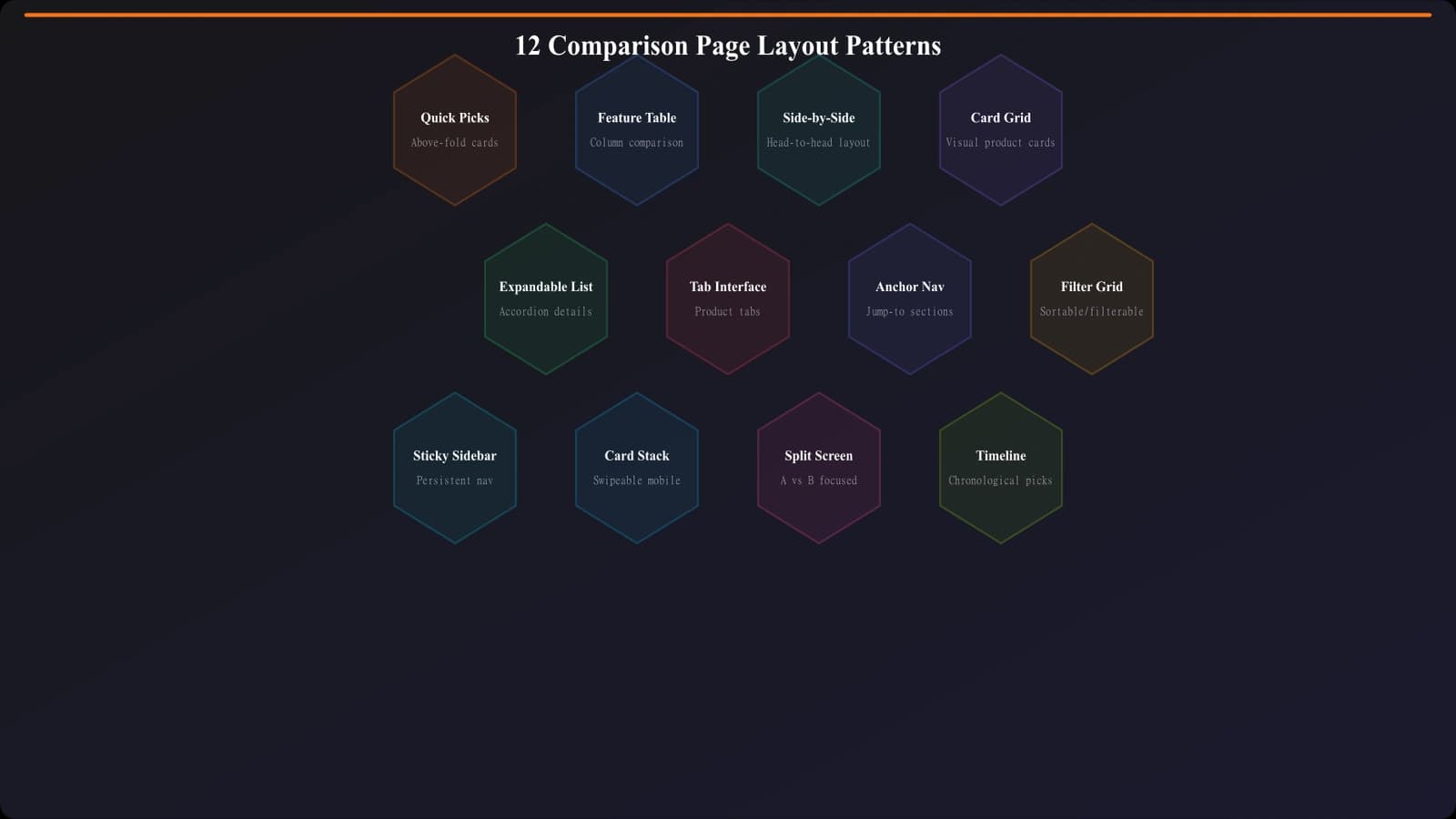
Quick Decision Patterns (1-4)
These layouts prioritize fast decisions. They assume the visitor knows roughly what they want and needs confirmation or a quick recommendation, not extensive research.
Pattern 1: Hero Quick Picks
The most impactful single pattern we've seen. Three prominently displayed recommendations appear above the fold—Best Overall, Best Budget, Best for [Key Segment]. Each includes product name, one-sentence value prop, and a CTA button.
Why it works: Respects visitors who already know what they want. Our data shows 30-35% of conversions on listicles with this pattern come from the quick picks section alone.
Best for: Listicles, best-of pages, categories where users often have clear preferences.
Pattern 2: Winner Spotlight
A single “Editor's Choice” or “Top Pick” featured prominently with expanded details, followed by runners-up in a more compact format. The spotlight section includes pricing, key differentiators, and primary CTA with supporting trust signals.
Why it works: Decision fatigue is real. Many users want you to just tell them what to pick. This layout does exactly that while still offering alternatives.
Best for: Categories with a clear best option, affiliate content where one product has significantly higher commissions, or when your testing confirms a standout winner.
Pattern 3: Use Case Grid
Instead of ranking products 1-10, this layout organizes by use case: “Best for Freelancers,” “Best for Agencies,” “Best for Enterprise.” Each use case gets a card with the recommended product and brief justification.
Why it works: Lets users self-select into their segment immediately. No need to read about enterprise features if you're a freelancer.
Best for: Products with distinct user segments, categories where one size doesn't fit all.
Pattern 4: Sticky Summary Bar
A fixed bar at the top (desktop) or bottom (mobile) that shows the #1 pick with a CTA, visible as users scroll through the full content. Updates to show whichever product is currently in viewport as the user scrolls.
Why it works: Keeps conversion path accessible at all times without interrupting reading. Users can continue researching until they're ready, then act instantly.
Best for: Long-form comparison content, research-heavy audiences who scroll extensively.
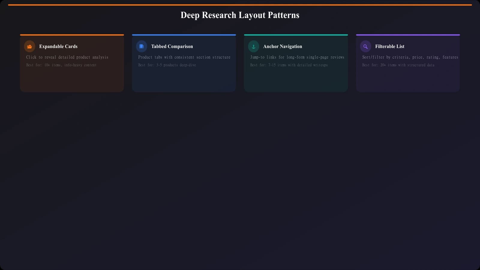
Deep Research Patterns (5-8)
These layouts support thorough evaluation. They assume the visitor wants to understand options in depth before deciding.
Pattern 5: Expandable Cards
Each product appears as a compact card showing name, rating, price, and key differentiator. Clicking expands to reveal full details—features, pros/cons, detailed analysis. Users can expand just the products they're interested in.
Why it works: Reduces initial overwhelm while keeping full information accessible. Users control their depth of research.
Best for: Long lists (10+ products), categories with significant feature complexity, mobile-first audiences.
Pattern 6: Tabbed Comparison
Products presented in tabs—click a product tab to see its full details. A persistent comparison bar at the top lets users add products to a side-by-side view. Combines single-product depth with multi-product comparison.
Why it works: Supports both sequential reading (one product at a time) and direct comparison (selected products side by side).
Best for: VS pages, technical products where feature-by-feature comparison matters.
Pattern 7: Anchor Navigation
A sticky sidebar or top navigation showing all products as jump links. Clicking scrolls smoothly to that product's section. Progress indicator shows where user is in the content.
Why it works: Gives users a map of the content and lets them jump to what interests them. Reduces scroll fatigue on long pages.
Best for: Long-form listicles, categories where users might want to skip to specific products.
Pattern 8: Filterable List
Products displayed with filter controls—price range, features, ratings, use case. Users can narrow the list to products matching their criteria before diving into details.
Why it works: Personalizes the experience. Showing only relevant products increases engagement with what remains.
Best for: Large product catalogs, categories with highly variable user needs, PSEO at scale.
Generate High-Converting Layouts
Create comparison pages with proven layout patterns—quick picks, smart navigation, optimized product cards.
Try for Free
Comparison-Focused Patterns (9-10)
These layouts emphasize direct side-by-side comparison, ideal for VS pages and head-to-head content.
Pattern 9: Split Screen Comparison
Two products displayed in parallel columns, synchronized scrolling. Each feature/category aligned horizontally so users can compare directly without jumping around.
Why it works: The most natural format for “A vs B” comparisons. Users see exactly how products differ on each dimension.
Best for: Head-to-head comparison pages, categories where two products dominate.
Pattern 10: Feature Matrix Table
A comprehensive table with products as columns and features as rows. Checkmarks, X's, and values show capability at a glance. Sticky header keeps product names visible while scrolling.
Why it works: Maximum information density for comparison. Power users love this format.
Best for: Technical audiences, feature-heavy products, enterprise software comparisons.
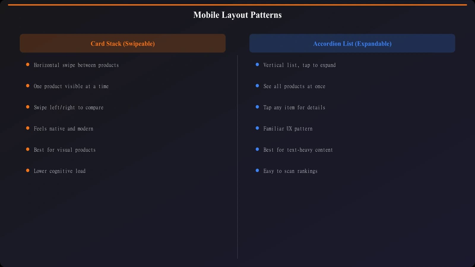
Mobile-First Patterns (11-12)
Over 60% of comparison page traffic often comes from mobile. These patterns prioritize the mobile experience.
Pattern 11: Card Stack
Products as swipeable cards, one per screen. Users swipe left/right to browse products. Each card contains enough information to decide or compare—image, key metrics, primary CTA.
Why it works: Familiar mobile pattern (dating apps popularized it). Focuses attention on one product at a time.
Best for: Mobile-heavy audiences, visual product categories, quick-decision content.
Pattern 12: Accordion List
Products displayed as expandable accordion items. Only product name, rating, and price visible initially. Tap to expand full details. One product expanded at a time.
Why it works: Minimizes scrolling and visual overwhelm on small screens. Users drill into what interests them.
Best for: Mobile-first design, long product lists, categories with detailed specifications.
Choosing the Right Pattern
Mixing patterns is often the right approach. A typical high-performing comparison page might combine:
- Pattern 1 (Hero Quick Picks) for above-fold immediate recommendations
- Pattern 5 (Expandable Cards) for the main product list
- Pattern 7 (Anchor Navigation) for easy jumping between products
- Pattern 11 (Card Stack) as the mobile adaptation
Consider your audience's decision style. Enterprise software buyers often prefer Pattern 10 (Feature Matrix) for thorough evaluation. Consumer audiences often prefer Pattern 3 (Use Case Grid) for quick self-selection. Test with your actual users.
| User Type | Decision Style | Recommended Patterns |
|---|---|---|
| Decisive buyer | Wants recommendation, not research | 1, 2, 4 |
| Thorough researcher | Reads everything before deciding | 5, 6, 7 |
| Technical evaluator | Compares specs and features | 6, 9, 10 |
| Mobile browser | Scanning on phone, limited attention | 1, 11, 12 |
Implementing These Patterns
Layouts are templates for human attention. Each pattern in this guide is designed to match how certain types of users naturally consume comparison content. The goal isn't to force users into a pattern—it's to remove friction by matching their expectations.
Start with one or two patterns that match your primary audience. Implement them cleanly. Measure engagement and conversion. Then iterate—add complementary patterns, test variations, optimize based on data.
Remember that layout is just one piece of the conversion puzzle. Content quality, data accuracy, trust signals, and CTA design all matter too. But layout is often the highest-leverage change because it affects how all other elements get consumed.
For the technical foundation these layouts need to perform well, see our Technical SEO for PSEO Sites guide. And for complete conversion optimization, combine these layout patterns with the strategies from our high-converting listicle teardown.
Product Manager at BestPage. Pioneer in AEO research since 2024, exploring the convergence of SEO and GEO (Generative Engine Optimization). Led multiple AI-powered content optimization projects that achieved 300%+ citation increases in ChatGPT and Perplexity.