
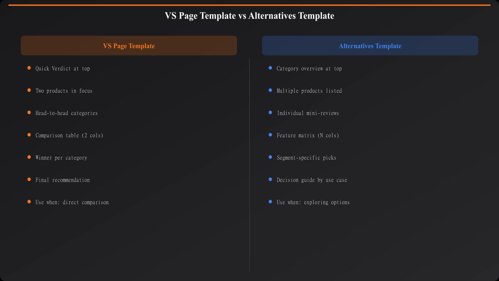
Not all comparison pages are created equal. When someone searches “Slack vs Teams,” they're looking for something very different than when they search “Slack alternatives.” The first query wants a direct head-to-head. The second wants a list of replacements for a product they probably already know.
This distinction matters for template design. Use the wrong structure and your page won't satisfy the intent, no matter how good your data is. A VS page template doesn't work for alternatives content, and vice versa.
This guide provides ready-to-use template structures for both page types. You'll get the section breakdown, the component logic, and filled examples showing how everything works together. Adapt these to your specific needs, but use them as proven foundations rather than starting from scratch.
These templates fit within the broader production workflow covered in our PSEO Production System guide. If you're building at scale, read that first for context on how templates connect to data pipelines and quality control.
The VS Page Template
VS pages compare two or three specific products that the reader has already identified. They've narrowed down their options and need help making a final decision. Your template should facilitate direct comparison at every level.
Section-by-Section Breakdown
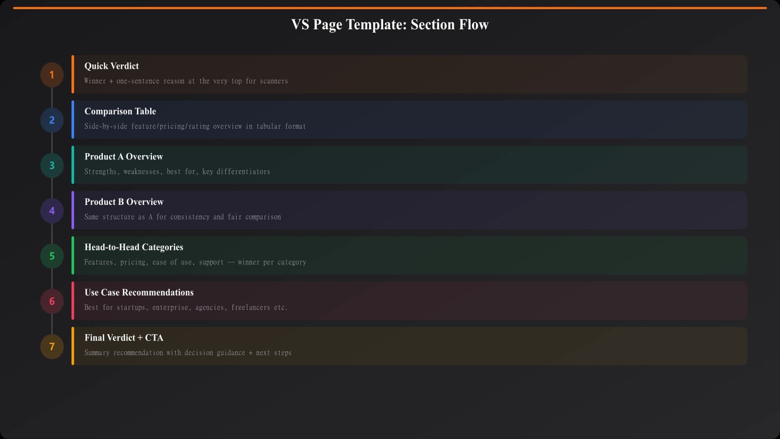
Section 1: Quick Verdict
Start with the answer. Many readers just want to know: which one should I pick? Give them a quick verdict upfront—one to two sentences stating which product wins for which use case. This isn't the full analysis; it's the executive summary.
Include a scenario-based recommendation. “Choose Slack if you prioritize integrations. Choose Teams if you're already in the Microsoft ecosystem.” Simple, direct, actionable.
Section 2: Comparison Table
Right after the verdict, show a feature comparison table. This is the most scannable format for side-by-side analysis. Include pricing, key features, best-for use cases, and standout differentiators.
Keep the table focused—8-12 rows maximum. Too many rows overwhelm rather than help. Choose the comparison points that actually matter for the decision.
Section 3: Product Overviews
Give each product its own section with consistent structure: what it is, who it's for, key strengths, notable weaknesses. These should be substantial but not exhaustive—you're providing context for the comparison, not complete product reviews.
Section 4: Head-to-Head Categories
This is the core of your VS page. Break the comparison into 4-6 specific categories: pricing, features, ease of use, integrations, support, whatever matters for this product type. For each category, compare both products directly and declare a winner.
Don't be afraid to call winners. Readers want opinions, not neutral recitations of features. “For pricing, Slack wins. Here's why...”
Section 5: Final Verdict
Expand on the quick verdict with more nuance. Summarize the category winners, discuss tradeoffs, and give clear recommendations for different user types.
The Alternatives Page Template
Alternatives pages anchor to a single product and present options for people looking to switch or explore similar tools. The structure is fundamentally different—you're not doing head-to-heads, you're showing range.
Section-by-Section Breakdown
Section 1: Why Look for Alternatives
Acknowledge why someone might be searching. Common reasons include pricing concerns, missing features, company changes, or simply wanting to evaluate options. This builds credibility—you understand their situation.
Keep this brief. Two to three short paragraphs maximum. You're setting context, not writing a dissertation on the anchor product's shortcomings.
Section 2: Quick Picks
Similar to listicles, offer immediate recommendations for common scenarios: best overall alternative, best budget option, best for enterprise, best for specific use case. This helps impatient readers jump to relevant options.
Section 3: The Alternatives List
Your main content: 5-10 alternatives, each with its own section. Unlike VS pages where you compare two products directly, alternatives pages should compare each option back to the anchor product. “Unlike Slack, this tool offers...” “Where Slack falls short, this excels...”
Each alternative section should cover: overview, how it differs from the anchor, pricing comparison, best-for use case, key pros, and key cons.
Section 4: Comparison Summary
A consolidated view that helps readers compare alternatives against each other, not just against the anchor. This can be a table or a categorized summary.
Section 5: How to Choose
Decision guidance that goes beyond “consider your needs.” What questions should someone ask themselves? What are the real tradeoffs? Give them a framework for making the decision.
Generate Comparison Pages That Convert
Build VS pages and alternatives pages with templates that match what searchers actually want.
Try for FreeFilled Example: VS Page
Let's see how the VS template works with real content. Here's how the sections would look for a “Notion vs Coda” comparison.
Quick Verdict (as it would appear):
“For most users, Notion is the better choice—it has a larger template ecosystem, better mobile apps, and more intuitive interface. Choose Coda if you need advanced database automation or prefer spreadsheet-style logic in your docs.”
Comparison Table (simplified):
The table would show rows for: Starting price, Free tier limits, Key strength, Learning curve, Mobile apps, Integration count, Best for, and Rating. Each column represents one product with concise values.
Head-to-Head Categories (excerpt):
For “Ease of Use” you'd write something like: “Notion wins on ease of use. While both tools have learning curves, Notion's interface feels more familiar, closer to traditional note-taking apps. Coda's spreadsheet-influenced design is powerful but can feel overwhelming for users who just want simple documentation. Our testing showed new users became productive with Notion in about 2 hours versus 4-5 hours for Coda.”
Each category follows this pattern: declare a winner, explain why, provide evidence.
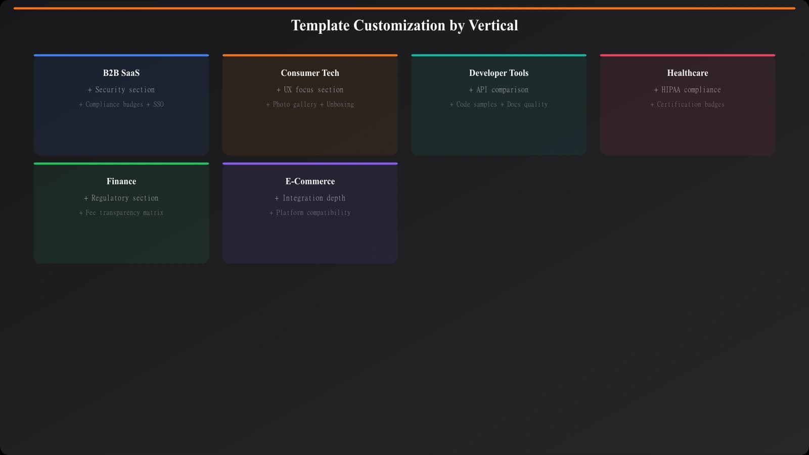
Customizing for Your Use Cases
These templates are starting points, not rigid prescriptions. Here's how to adapt them for common scenarios.
For B2B SaaS comparisons: Add sections for enterprise features, security compliance, and implementation complexity. B2B buyers care about these factors heavily.
For consumer products: Emphasize user experience, value for money, and community support. Include more visual elements and real user quotes if you have them.
For technical tools: Add API documentation quality, developer experience, and technical architecture comparisons. Your audience expects depth.
For price-sensitive categories: Expand pricing sections. Include cost calculators if possible. Show total cost of ownership, not just sticker price.
When comparing more than two products: The VS template gets unwieldy above three products. If you're comparing 4+ options, consider switching to the alternatives format or creating a dedicated multi-product comparison variant.
Common Template Mistakes
A few patterns to avoid as you implement these templates.
Fence-sitting on verdicts. If every category ends with “it depends on your needs,” you haven't helped anyone. Take positions. Be willing to declare winners. Readers came for guidance, not neutrality.
Identical section lengths. If every product overview is exactly 150 words and every category comparison is exactly 200 words, your template is too rigid. Let content breathe—some products need more explanation than others.
Missing the switching context on alternatives pages. Someone searching “X alternatives” probably already uses X. Acknowledge this. Compare back to the anchor product consistently. Don't treat it like a generic category listicle.
No update timestamps. Comparison content goes stale fast. Pricing changes, features launch, products sunset. Include visible “last updated” dates and actually keep content current.
Forgetting mobile readers. Comparison tables that work beautifully on desktop often break on mobile. Design your tables with responsive layouts or provide mobile-friendly alternatives.
Implementing These Templates
You now have the structural foundation for both major comparison page types. The VS template works for direct head-to-heads where readers have narrowed to specific options. The alternatives template works for switching-intent queries where readers anchor to one known product.
Start by building one of each in your highest-value category. See how they perform. Refine based on engagement data and reader feedback. Then scale to additional categories using your tested templates.
Remember: templates enable scale, but they don't replace quality. The data powering your templates matters just as much as the template structure. See our guide on Data Collection at Scale for building the data foundation these templates need.
For listicle-style content (best-of pages, top-X lists), the template approach differs. Check out Listicle Template Design for that format.
Product Manager at BestPage. Pioneer in AEO research since 2024, exploring the convergence of SEO and GEO (Generative Engine Optimization). Led multiple AI-powered content optimization projects that achieved 300%+ citation increases in ChatGPT and Perplexity.